MUI 3.0 - Tmall App Design Guideline
In 2011, Alibaba Group Chairman and CEO Jack Ma announced Tmall to be an independent business under Alibaba Group. Up till 2014, Tmall has more than 5 million Daily Active Users for the app. At that time, I was an interaction designer in the User Experience Department. The team decided to launch a project to unify the design of the mobile app, so that despite of rapid changes and business requirement, all the interaction and visual design are consistent.
This guideline includes Icon, Loading, Tab, Banner, Responsive Rules, Annotation and all other aspects of design. Here are parts of the document I created with other UX designers in the team. This project is called MUI3.0 and is an ongoing project in the team.
2014.8
Design Guideline, Visual Design, Interaction Design
Sketch, After Effect
1. Icons Design
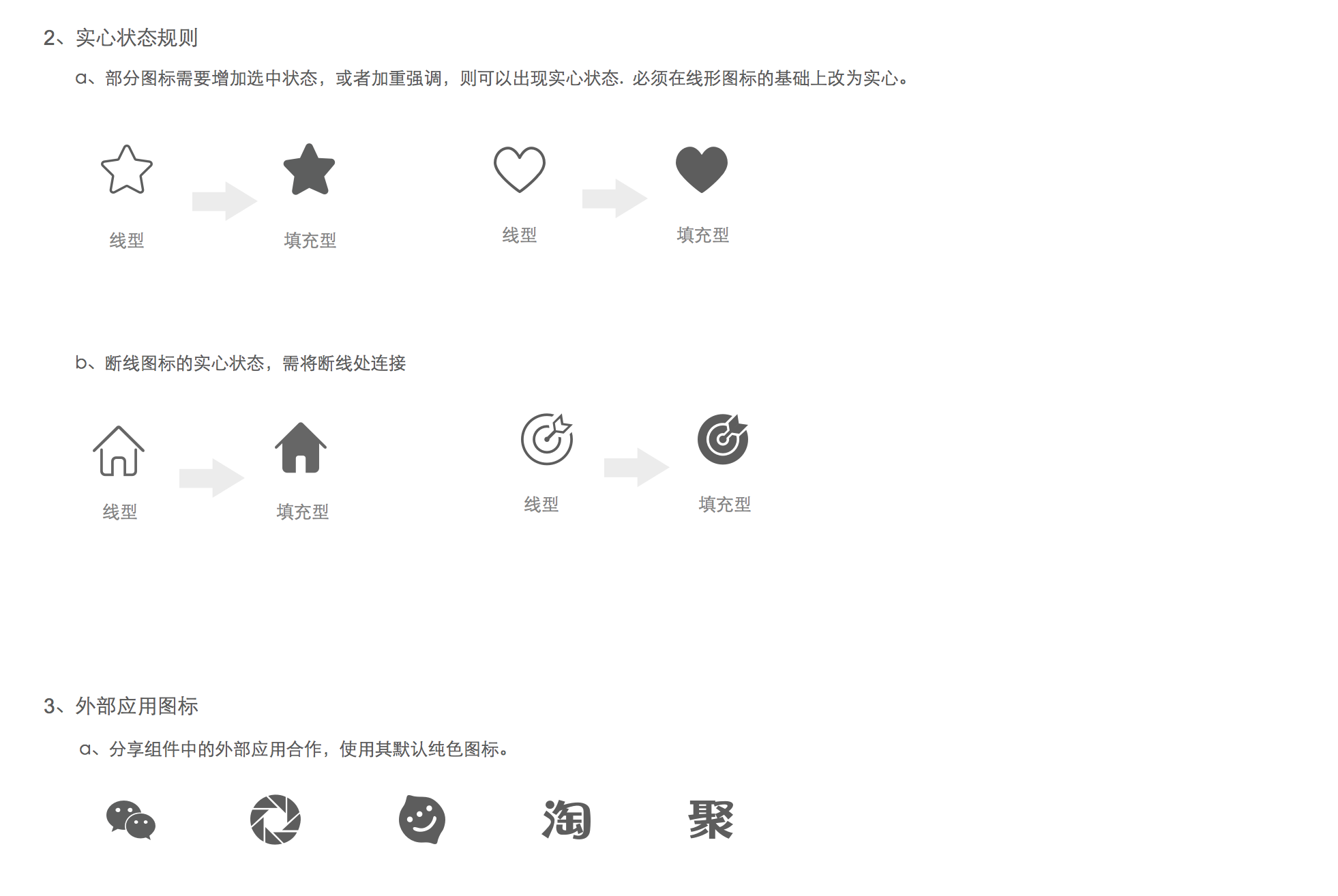
To make the icons look consistent, there are some rules while designing the icons. There are gaps in lines and these gaps differentiate objects in an icon. Usually, the gap is on the bottom right corner or top left corner. According to different usage, the icons can be either line shape style or filled shape style.
2. Loading States
3. Responsive Rules
At that time, iPhone6 Plus just came out and the phone screen came into 3 types: @1x, @2x, @3x. Before iPhone6 Plus, the developers developed pages with unit px. If designers delivered a design to them in a size of 500px, they would restore to 250pt. iPhone6 Plus's design is 1.5 times of iPhone's. To unify all our design files, we simplified all the design into unit pt and then exported out 3 types of screen according to four rules:
- Fluid Text - The size of font will not chage on different devices. The wider the sceen is, the more text will be.
- Fexible Widget - Widgets change according to screen width. The height will not change.
- Scable Image - Images, such as banners, photos and other bitmaps scale in ratio. Do not change the shape.
- Proportional Margin - The margins between texts, images, widgets and the screens scale proportionally.
4. Tab
5. Banner
6. Annotation
Here are the examples for designer to make annotation to communicate with developers. In order to make one design file that is suitable for different screen sizes, it is important to make it clear which part is fixed and which part is scaleable according to screen width. We used black color to tell that the space is fixed while orange one scalable.
Following the guideline, here is an example design I created for Tmall Baby Pages.


