Yunbaoxiao
Yunbaoxiao, 云报销, is a software company that develops a travel and expense web and mobile application for personal and business use. Its namesake application allows users to manage expense transactions, upload receipts, generate receipts from online sales and automatically create expense reports as well as allows finance teams to approve and export reports. Founded within a year, it has successfully served over 300 companies in China.
2015.12 - 2016.3
User Research, Branding, Interaction Design, Visual Design
Sketch, Framer, Azure
Ideation
At the very beginning, we discovered that it was painful for individual staff to gather receipts and wait for approval from managers.Is it possible for staff to just take a picture of the receipts and immediately get approval from managers and finance teams? Can we free the finance teams from checking hundreds of and even thousands of receipts by the end of each month? Is there a way that managers can approve expense at anytime and everywhere?
Competitive Analysis
These were 4 potential competitors in the market at that time.
I did this research and made this form to compare them from different perspectives, so that we could better develop our product.
Observation
1. Preparation
Before the observation, as a primary research, we interviewed 5 companies who were currently using our app. They were Deloitte, Founder Securities, Bank of China Head Office, Hillhouse Capital and Phoenix Healthcare. We got pain points from general staff, managers and financial department, so that we had more focus while observation. We also made charts from the data of our users about their company size and industry type.
2. Experience Map
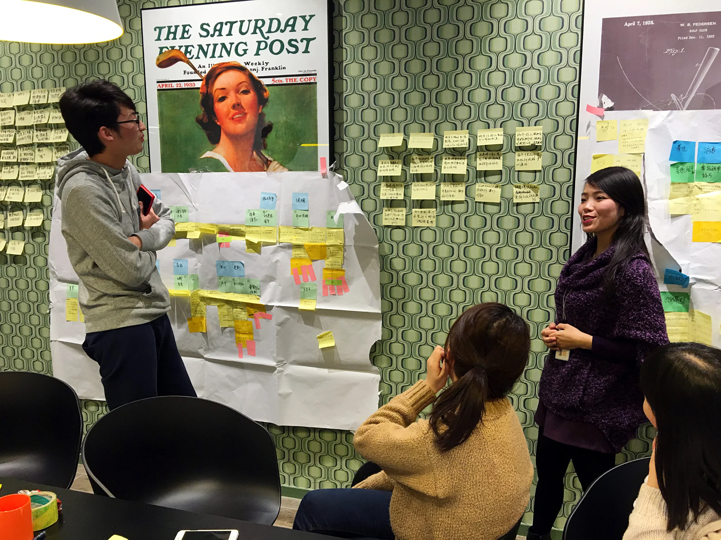
Totally, we conducted 5 observation in 5 companies. For each one, we analyzed user behavior data with Experience Map.
- Yellow represents 4 types of user data.
- Green represents each step.
- Blue represents each function.
- Orange is the solution
- We also voted with smaller yellow and orange stickers that indicated the priority and importance of the issues.
3. Touchpoints
From the Experience Maps, we also could summarize the Touchpoints of our users and then prioritize some steps.
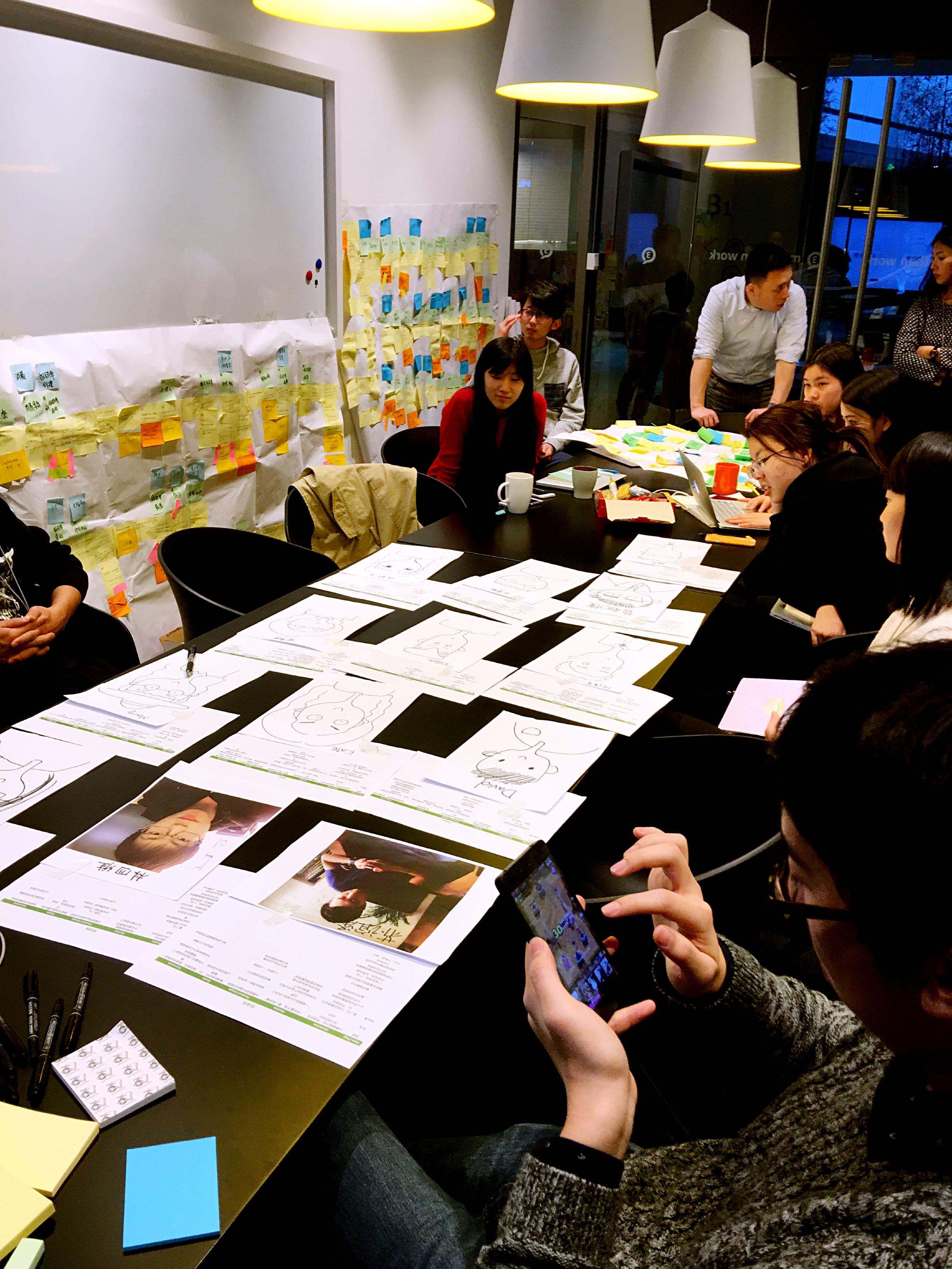
4. Persona
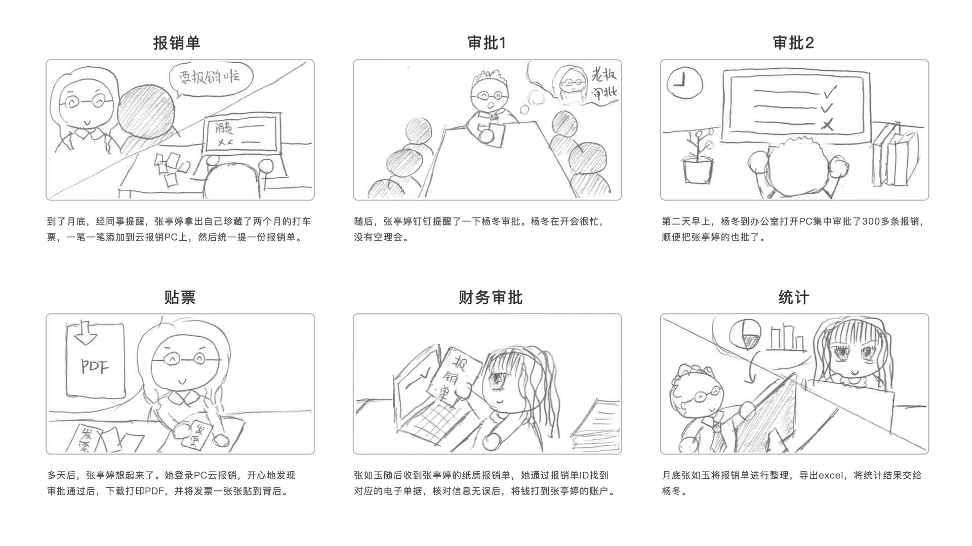
5. Scenario
Usability Testing
1. Schedule
First of all, I made this schedule and recruited our participants with characteristics from the persona.
2. Paper Prototype
Next step, I prepared Moderator Script and performed the testing with these paper prototypes, which our participants could interact with.
3. Participant Task List
Create this participant task list to research on specific problems.
4. Analysis
Here is the form of how we utilize all the usability testings.
Through these two user research method, observation and usability testing, we got some very valuable results.
- The results gave us direction and priority of further developing our product.
- Users finally had a channel to talk with us effectively and they felt being valued.
- Usability improved. Bugs were fixed.
- The whole company became on the same page with better understanding of our users.
Branding & Guideline
1. Logo Design
The logo conveys the idea that people can manage expense transactions on the cloud. We chose a feminist bright pink color because we want to be more friendly and closer to our users.
2. Icon Design
To make the product more integrated, I also created this set of icons which are all composed of lines, rounded corners and gaps between lines.
3. Responsive Design Guideline
I create this guideline so that programmers could easily understand and the UI of the whole app was more consistent. It turned out to be very effective and efficient.
Wireframe
1. Card Sorting
After the user research, we were able to sort out key features of our product.
2. User Flow
For different functions and features of the product, I created use flows for each of then. For example, here is the use flow for landing scenario when a user first opens the app/website.
3. Wireframe
Then I made these wireframes to clearly demonstrate the logic behind each page. Here is the example of profile pages.


